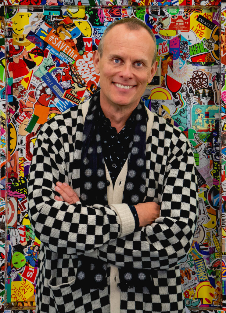
Artist Tom Eslinger will unveil ‘Stuck in My Head’, his first solo exhibition, at Chicago’sCenter on Halsted from 2nd February 2nd to 30th March, 2024.
Eslinger made a name for himself in the advertising world as a Cannes-Lions winning Global Creative Director at Saatchi & Saatchi and Burson Marsteller. During his years as a Worldwide Creative Director at Saatchi & Saatchi’s headquarters in London, Eslinger indulged his childhood love of stickers, and amassed an eclectic sticker collection, which decorated the door to his office and his desk. The desk had once belonged to advertising behemoth turned art world savant Charles Saatchi, and when Eslinger left Saatchi & Saatchi he requested that he take the door and the desk with him as he relocated to his native USA. Eslinger left the advertising industry on a high, eventually settling in Chicago after many years of globe-trotting, and decided to pursue his passion for fine art. The sticker-covered door was transported to Chicago where it serves as a memory of his time in advertising, and acts as a kind of portal from his childhood as a music and skater-culture memorabilia hoarder, to his adulthood reinvention as a fine artist. The desk was eventually disassembled and parts of it appear in works appearing in his first show.

Eslinger studied at the Minneapolis College of Art & Design (MCAD) and is a Professor of Communications at Columbia College, and his typographical design work can be found in the Smithsonian’s Cooper-Hewitt Collection and the permanent Design Collection of MOMA in New York City.
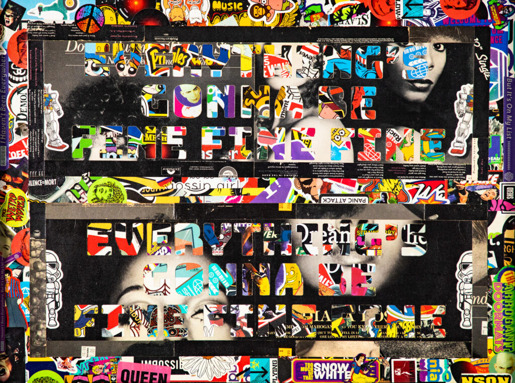
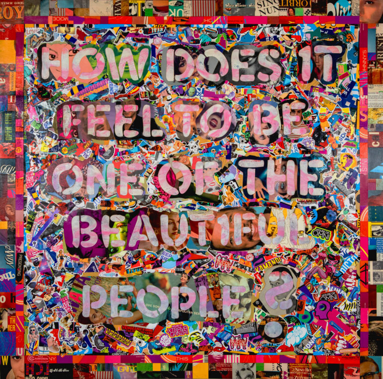
His inaugural solo exhibition ‘Stuck in My Head’ will feature a meticulously crafted collection of unique artworks created from laser-cut vintage album covers and hand made stickers, inspired by uplifting song lyrics such as; ‘We learn the secret of a kiss and how it melts away the pain’, ‘How does it feel to be one of the beautiful people’, and ‘These are the days of miracles and wonder’.
Eslinger’s inspiration comes from the work of seminal Pop Artists including Andy Warhol, Robert Indiana and Robert Rauschenberg, as well as the Punk aesthetic of Jamie Reed’s Sex Pistols album covers and Hipgnosis’s iconic vinyl artwork for seminal bands and musicians of the 60s and 70s including Pink Floyd, Led Zeppelin and Paul McCartney. Eslinger’s artwork combines echoes of Pop Art, Punk and Psychedelia with an obsession for collecting memorabilia such as stickers, sew-on patches and Skateboard ephemera that began as a teenager visiting Minneapolis and his home state North Dakota.
Oasis co-founder Noel Gallagher is quoted in Anton Corbjin’s documentary ‘Squaring the Circle (The Story of Hipgnosis)’ describing vinyl thus: ‘Vinyl is the poor man’s art collection’. Eslinger literally converts vinyl album covers into art by combining it with clever typography and unforgettable music lyrics to create unique artworks encapsulating a feeling of nostalgia with uplifting mantras that offer an escape from the darkness of the contemporary world.
Culturalee spoke to Tom Eslinger in Chicago as he prepares for his solo show at Center on Halsted.
Culturalee: You are quoted as saying “It all comes from the same place: stickers and music”. Have you always been a collector of memorabilia and music?
Tom Eslinger: Yes. Ever since I was a little kid. I grew up in North Dakota, the geographical centre of North America. My sisters all collected records. One of the pieces in the show comes from The Beatles track ‘baby you’re a rich man.’
I collected comic books, music and sew-on patches like 1960s symbols, ‘Stop the war’ slogans and Rolling Stones lips. I would print them out and glue them down like stickers. I’m still using stickers I got in a rummage sale in Pasadena in 1970. When my parents passed away, I was finding boxes full of album covers and stuff that I couldn’t let go of. Music and visual things were always stuck together for me.
I started playing music when I was a kid and developed a love of the visual sticker stuff that went with it. I could sew a patch on my jacket and that became a way for me to find my people. I found my tribe.

You left a successful career as a Cannes-Lions winning Global Creative Director at Saatchi & Saatchi and Burson Marsteller to pursue a career as an artist, and your design work can be found in the Permanent Design Collection of New York’s MOMA and the Smithsonian’s Cooper-Hewitt Collection. Do you feel more free when you’re creating fine art for a gallery show, than when you were constrained creatively by the demands of brands and clients in advertising?
The thing with advertising is that you age yourself out of it. I still work with clients, but I work with clients where I can add value to it and understand their business.
I never let go of the Andy Warhol ‘mass-production, Pop-meets-graphic-design’ approach to making visual things. It’s not a natural extension of my graphic design skills to start making watercolours, so I went in the direction of visualising my love of music and pop culture memorabilia and combining it with my knowledge of typography and skills as a graphic designer. Working in advertising for so long, and knowing about production and making things with digital tools like laser-cutters, came in really useful when I decided to pursue a fine art path. I studied art history, so I knew that Warhol, Kazimir Malevich, James Rosenquist had created commercial, ‘ad-related’ work and that inspired me.
Whatever the song is that I’m working from within the art or collage, there are other bits of the lyrics in there – I create custom stickers with bits and pieces inspired by lyrics and imagery like little ‘Easter eggs’. When I started working with a laser cutter and applied that technique and precision to my art and used more album covers and vinyl.
When I left Saatchi & Saatchi, they asked what I wanted as a going away present. I said I wanted the door of my office and my desk that was covered in stickers. I shipped it all to America and put the door up in my house. When I started making stuff, I had by then covered the entire desk in stickers. Two pieces in the show are part of Charles Saatchi’s old desk that I had covered with stickers and manipulated with typography incorporated.

Your inaugural art exhibition will be hosted by Center on Halsted in Chicago. How did that partnership come about?
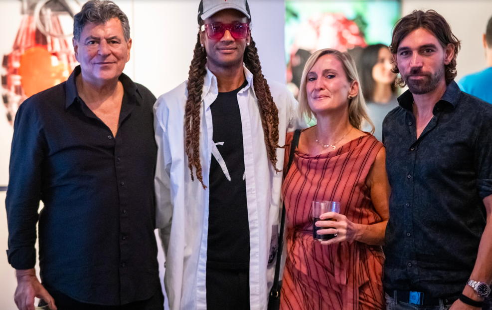
Center on Halsted is the Midwest’s most comprehensive community center dedicated to advancing community and securing the health and well-being of the Lesbian, Gay, Bisexual, Transgender and Queer (LGBTQ) people of Chicagoland. The center runs an artistic programme and the curator came to see me in my studio one day, and offered me an exhibition.
Center on Halsted supports the LGBTQ community through events, workshops, exhibitions and provides fitness and health services too. They have a vision of a thriving lesbian, gay, bisexual, transgender and queer community, living powerfully in supportive inclusive environments. As a gay man, I am very honored to have my work at the Center on Halsted. It’s beyond exciting.

The artworks in your upcoming solo exhibition are created using some unusual materials – laser-cut vintage album covers, printed vinyl and oil sticks – how did you come up with this process and does it feel like sacrilege to cut up vintage album covers?!
When I make a piece, I work on the surface with more traditional tools: I love writing and drawing the inspiration I get from the song lyric on the surface first. I keep all the smaller cut off bits, then I use that to make the border and often incorporate other parts into other work I’m making at the same time. I like they way they ‘talk’ to each other by sharing pieces of colour, complimentary pieces and shapes. Each one takes about 2 or 3 weeks and there are 12 new pieces in the exhibition. The starting point for each artwork is a lyric from a song. They’re all pretty big – 4 x 4 ft – in the proportion of an album cover. I take an album and figure out what the colour palette will be. When I pick out the albums I pick them out by colour or pieces of typography or the way I imagine it made someone feel when these records were a part of their lives. When I find areas where people have written messages on the album cover or written ‘property of so-and-so’ I incorporate that into a piece. I get all of my records at estate sales and bargain bins and hope my art helps keep that emotional connection, but in a new context.
In a world that’s increasingly full of conflict and angst, your art radiates hope in the form of positive mantras such as ‘Everything’s gonna be fine fine fine’, ‘miracles and wonder’ and ‘We learn the secret of a kiss and how it melts away the pain’. Do you find that making art is a meditative process and the end result can help us escape from reality for a while?
I’ve certainly been influenced by music and visuals from having my mind blown by Yellow Submarine as a 4 year old to sitting on Prince’s equipment cases and watching him play ‘Sign of the Times’ in full at First Avenue and my first Coachella in 1998. I’ll be listening to Nine Inch nails or Skinny Puppy or some other industrial band and think the lyrics are emotional, but a bit heavy. I prefer to make things that make people smile, so I make sure the lyrics I use for my artworks are all positive, like the Moby lyric ‘We are all made of stars’. For me personally, I don’t want to be standing in my studio surrounding myself with more negativity. Any positivity for me, any little light that takes away darkness through my art is a good thing.
People that have commissioned work from me have said things like ‘This is my wedding song’, so I’ll sit and talk to them about it and make a piece of art from that special lyric and try to channel the emotion and meaning into the piece that I create for them. People ask me ‘what style is this?’ Since I use traditional and digital tools to express my ideas, but always incorporating stickers and adhesive vinyl, I have often said that I “paint” with stickers and graphic images. That’s how I apply the colour, build the focal points and express a feeling. For example ‘Beautiful people’ is very pink and purple with a 1960s hippy London vibe and the way the song made me feel when I first saw ‘Yellow Submarine’ on TV as a 4 year old.
You studied at the Minneapolis College of Art & Design (MCAD) and are currently a Professor of Communications at Columbia College. Many other notable artists also had successful careers in advertising: Andy Warhol and Salvador Dali were acclaimed artists who also made advertising. Do you feel that the boundaries between art and advertising have decreased since you started out in your career?
Graham Fink does all his amazing stuff as a ground-breaking visual artist and has a successful career in advertising. When I worked on a Toyota campaign a years ago, Shepherd Fairey was commissioned to work on posters, which was really radical at the time, but it’s completely normal now for artists to be commissioned for advertising campaigns. Although Dali and Warhol were way ahead of the curve as they crossed over between fine art and advertising successfully back in the 1960s.
I think with artists now and collaboration being through Instagram and AI, you can make a reel or post a song and put it on Instagram or Soundcloud, and anyone can manipulate it. I don’t think generationally anyone sees that division anymore. Social media and Instagram have flattened the hierarchy between who’s an artist and not an artist. The only part I do on the computer is make the shapes for the laser cutter to cut and when I make a custom sticker and print it.
Your art has a vibrant Pop aesthetic in the tradition of British and American Pop Artists from the 1950s and 1960s such as Peter Blake, Roy Lichtenstein and Andy Warhol. Do you find inspiration in Pop Art, and how do you put your own unique spin on the style?
My inspirations include Andy Warhol, Robert Indiana, Mark Kostabi, James Rosenquist and Robert Rauschenberg. Jamie Reed who did Sex Pistols album covers, and stuff like Hipgnosis who created the artwork for some of the most iconic album covers for The Beatles, Pink Floyd, Led Zeppelin and other seminal bands of the 60s and 70s.
And I’m inspired by people, some of whom I got to work with like designing fonts for David Carson when he was doing RayGun Magazine and building interactive type pieces with Charles Spencer Anderson. The others I admired from a distance like The Designer’s Republic, Vaughan Oliver, Neville Brody, Paula Scher, April Greiman – the superstar DJs of graphic design. Scott Makela was one of my teachers and I was deeply affected by his painterly approach to Photoshop and typography.
I get a lot of inspiration from Fashion – Comme des Garçons, Raf Simons, Grace Wales Bonner, Brain Dead, Stella McCartney – I feel graphic design and imagery when I think of their clothing. I get obsessed with things from movies. My making art collided with MTV coming out so directors like Mark Romanek, Godley and Creme, Zbigniew Rybczyński, Sophie Muller all left a deep impression on me.
What other projects are you working on?
Once the show is hung, I’ll have a little rest and then work on the products I’m developing and get onto the commissions that are coming in. I’m working on a 5×3.5 foot piece right now and have a 4×6 and 2 4×4 pieces in various states of revealing themselves to me! The more unique commissioned projects are fun as well, like making a laptop cover for a drum and bass DJ and I’ve done 27 foot long x 11 foot tall backdrop for a theatrical musical. I would have a dozen creative projects running at the same time in 10 or more countries when I was a global creative director, so that skill comes in handy every day!
Tom Eslinger ‘Stuck in My Head’ is at Center on Halsted, 3656 N Halsted St., Chicago, USA from 2nd February 2nd to 30th March, 2024.


