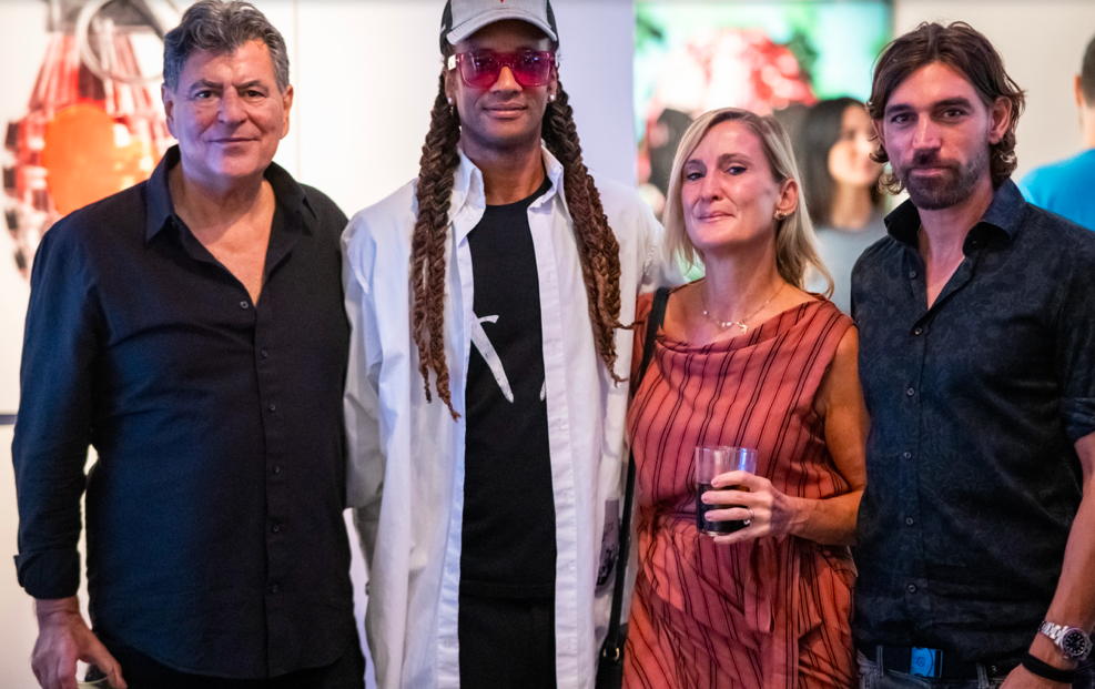
British artist and typographer Matt Eley has built a compelling artistic practice around a simple yet profound idea: words are not just vessels of meaning, but carriers of emotion, memory, and presence. In his work, typography becomes something deeply human, expressive, imperfect, and resonant. Eley recently created new work TURNS OUT IT’S A PRETTY COOL LOOK for the Art Below series at Pimilico, and people flocked to stand in front of it.
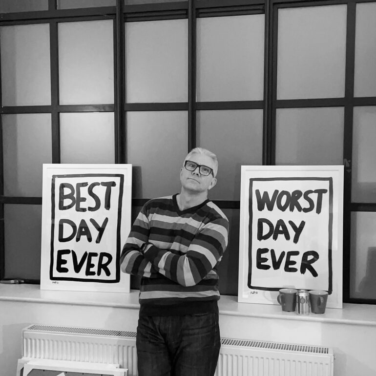
Through bold, gestural brushstrokes, Eley transforms familiar language into lived experience, inviting viewers to move beyond reading and into feeling. Each piece exists as both a personal imprint and a shared emotional landscape, where declarations, regrets, and fleeting moments of connection are held in visual form. With over three decades in design behind him, Eley’s transition into painting reflects a desire to create work that endures beyond the short lifespan of commercial campaigns.
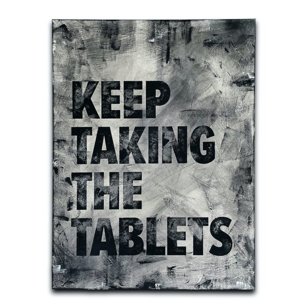
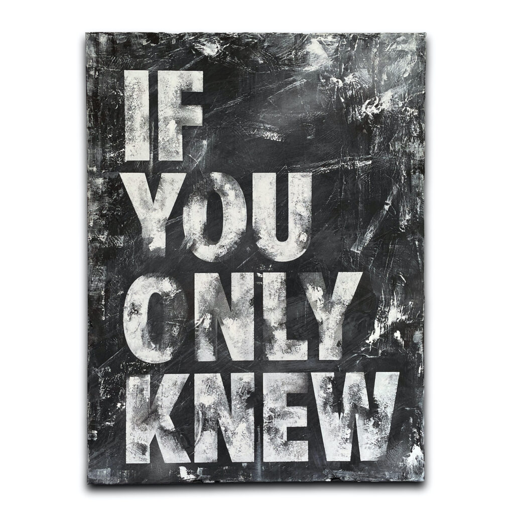
His collections Love Lettered and Echoes of Urban Decay embody this shift, exploring intimacy and impermanence through ink and acrylic. Where one captures the immediacy of stripped-back expression, the other traces the textures of time and the persistence of language against decay. In an era saturated with digital noise, Eley’s work returns words to the human hand, imbued with weight, vulnerability, and the power to linger long after the moment has passed.
Eley’s work can be both viewed and purchased through George Gallery in Brighton, and via Stopwatch Gallery, Thyme Contemporary, and Saatchi Art.
Culturalee talks to Matt Eley about art, graphic design, typography and the transition from running an agency to becoming an acclaimed fine artist.
You spent over 25 years running your own creative agency before transitioning into fine art. What prompted that shift, and how did your experience in a fast-paced, client-driven environment shape the way you approach painting today?
After nearly three decades running a creative agency, I became increasingly aware that the majority of the work I was creating was designed to burn brightly for a defined period of time, but was then destined to disappear. Campaigns would launch with real energy, live for a few weeks, then quietly vanish once they’d done their job. There was creativity in that process, but very little permanence or personal connection.
Over time, I felt a pull towards something that could hold weight beyond a scheduled campaign. Painting offered me that. It gives me space to create without needing to resolve anything or meet an external objective, and most importantly, it has permanence.
My agency background still shapes how I work today. I have a strong sense of discipline and clarity from design, but I’m now using that structure to hold something more open-ended. Where my agency work demanded answers, painting allows me to sit with questions.
Your background in graphic design is central to your artistic voice. In what ways does your formal training continue to inform your practice, particularly in composition, restraint, and visual communication?
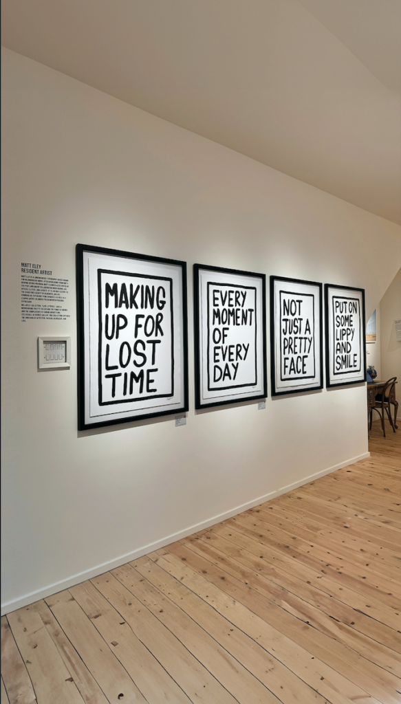
My design training is still very present in the work, particularly in terms of composition and restraint. I’m comfortable reducing things to their essentials and understanding how to control space, hierarchy, and balance.
A complex visual would dilute the emotional impact, so restraint is important. I don’t want anything to compete with the words, even colour could serve as a distraction. The discipline comes from design, but the intention is different. Instead of guiding someone toward a clear message, I’m creating space for ambiguity and personal interpretation. In a way, I’m using the tools of graphic design to do something you’re not traditionally meant to do, which is to hold emotion rather than resolve it.
Typography sits at the heart of your work. How do you translate something traditionally functional – letters and fonts – into something deeply emotional and painterly?
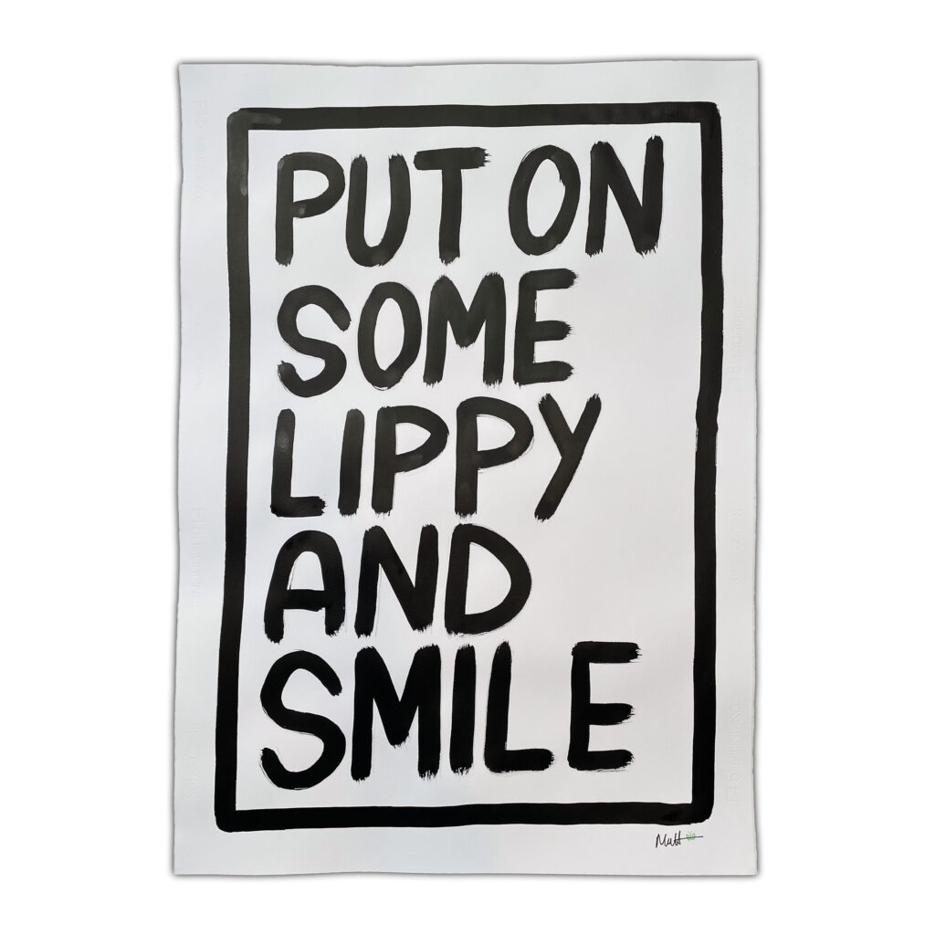
Typography is predominantly about clarity and communication, but I’m interested in what happens when you loosen that control. The words I use often start as something personal, a phrase that’s stayed with me, or words that carry a certain weight with them.
By painting them, they shift from being purely functional into something more human. The imperfections, the uneven edges, the visible brushwork, all of that gives the words a physical presence. It stops them being something you simply read, and turns them into something you experience. At that point, they’re no longer just letters on a surface, they become fragments of memory or emotion, that people can connect with in their own way.
You recently contributed to the Art Below project on the London Underground. What did you create for that space, and how did the context of a public, transient environment influence the message or form of your work?
Unlike a gallery, where engagement is intentional, the Underground is a passive, transient environment. You’re meeting people mid-journey, mid-thought, so the work has to communicate quickly with something that cuts through at a glance, but still offers depth on a second look.
The Underground also comes with constraints. Like many advertising spaces, there are strict rules about language and content. Even with years of agency experience, my first submission was rejected for including the word “battle”. Navigating those limitations is very much part of the process.
My aim was to create something that reflected the people travelling, something that might linger beyond the journey itself. I regularly use public transport and I’m fascinated by how people’s clothing shifts over the course of the day. The piece I finally submitted, TURNS OUT IT’S A PRETTY COOL LOOK was born out of observation. There are a number of subtly agreed ‘uniforms’ that people’s clothing adhere to, and I love to see people taking a chance on a different look or style. Some looks are winners, and some looks are losers, and you never know how they’re going to turn out until you try them.
Across your collections like Love Lettered and Echoes of Urban Decay, your work explores memory, permanence, and emotional resonance. Do you see your paintings as preserving moments that might otherwise be lost, and how do you hope audiences connect with them on a personal level?
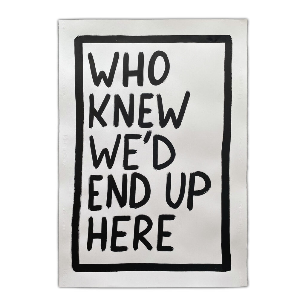
Yes, in many ways the work is about holding onto moments that would otherwise slip away. We all carry fragments of language with us, things that were said, or left unsaid, that stay long after the moment has passed.The paintings try to give those fragments a kind of physical presence. In Love Lettered my ink on paper work, that might feel intimate and immediate. In my canvas work Echoes of Urban Decay, it’s more about how those words endure over time, even as everything around them fades.
Ultimately, my work isn’t complete until someone brings their own experience to it. I’m not trying to prescribe a meaning, I’m creating a prompt. If someone sees a piece of my work and it connects to a memory, a relationship, or a version of themselves, then my work has done what it’s supposed to do.
Find out more about Matt Eley here: https://www.matteley.org/